Wednesday, June 3, 2026
Alrightie. Welcome to Grumpyville… I just lost an entire post because my Internet blinked off. And I was asking so nicely, for your help in choosing a book cover — and I so carefully described what the upcoming book is about. However, now I’m doing the bare basics. If you would please be so kind as to help me decide on the cover for my next nonfiction book? Tell me the one you like best in a comment… A, B, C, or D. If you could add “why” that would be great.
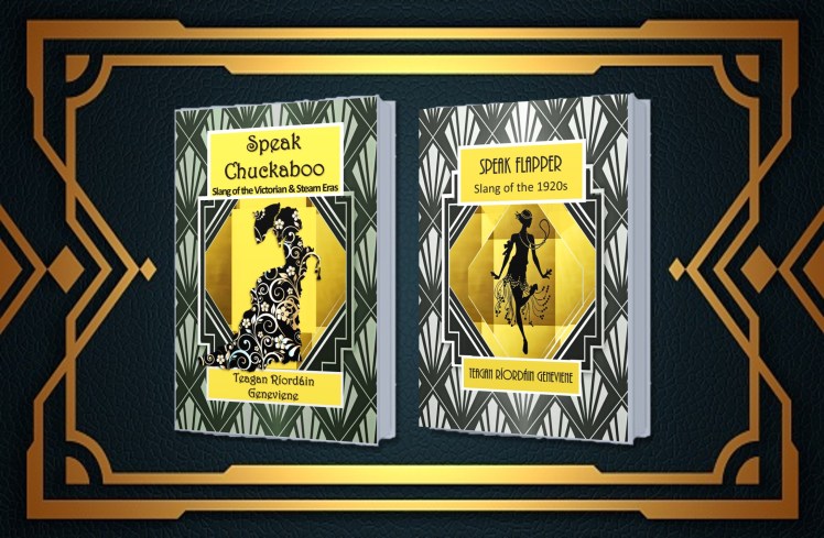
I’m showing you Speak Flapper above, for your reference, because this book is about the Roaring Twenties. It’s filled with loads of the kinds of details that authors can use to make their 1920s characters come to vivid life. Ready?
By the way — I wanted to keep it similar to Speak Flapper, but there were limits on that because of a few reasons… Maybe that isn’t all that important…
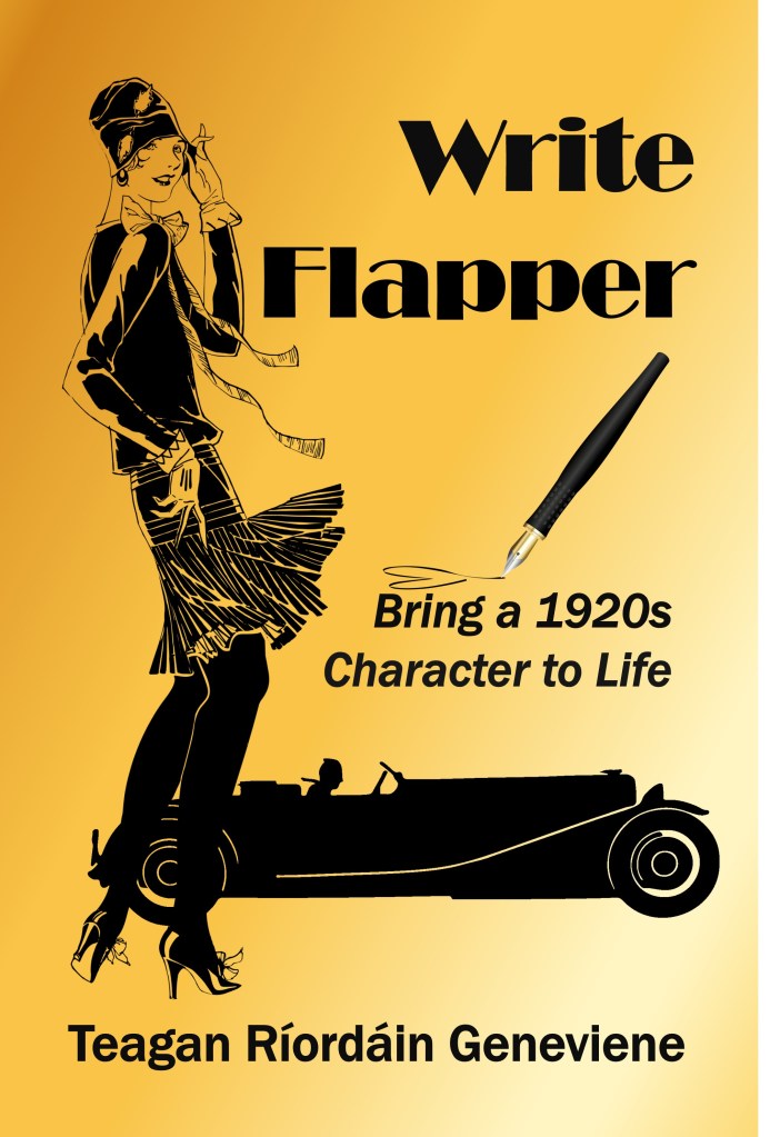
A
Black on gold, flapper and car
B
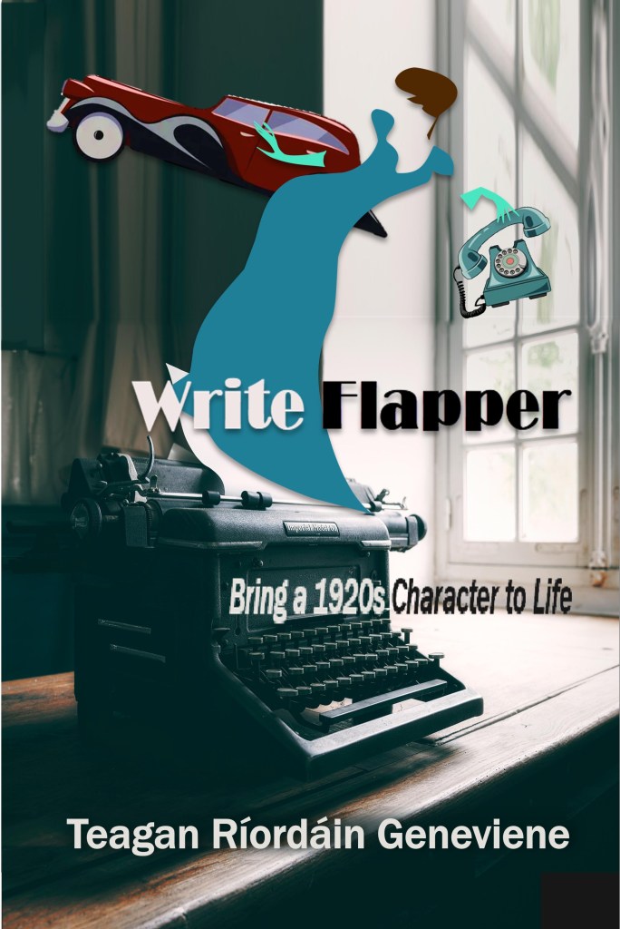
The least similar to the rest of my series, but maybe that’s okay…
Photo with cut-outs
C
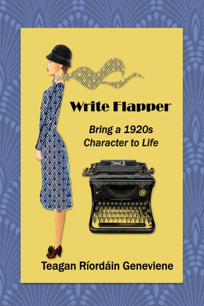
Cut-out flapper with typewriter and border
D
And lastly… Gold flapper dancing
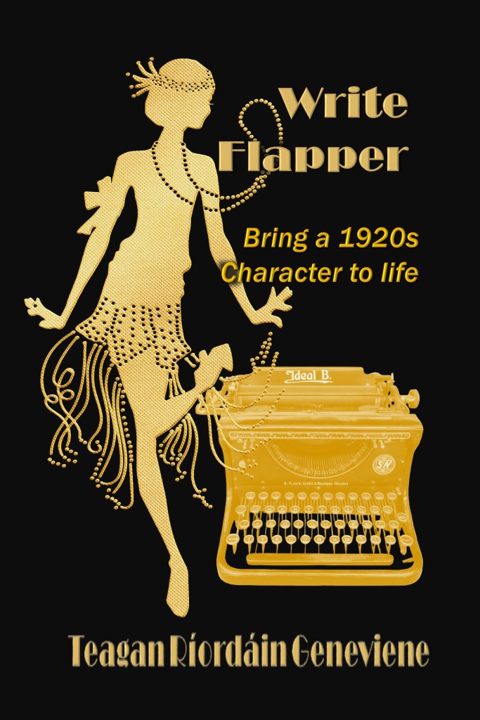
Let me know which of these works best for you, keeping in mind the kind of book it is. Wishing you a splendiferous rest of the week! Hugs.
♥ ♠ ♦ ♣
Yes, here’s the obligatory shameless self-promotion…
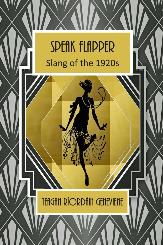
Speak Flapper: Slang of the 1920s
Universal Purchase Links
Speak Flapper
Kindle: relinks.me/B083HNK3BB
Paperback: relinks.me/1656168553
♥ ♠ ♦ ♣
This blog is entirely human-written. Furthermore, the author expressly prohibits any entity from using this publication for purposes of training AI technologies to generate text. This is a work of fiction. Characters, names, places, and incidents are either the product of the author’s imagination or are used fictitiously, and any resemblance to actual persons, living or dead, business establishments, locales, or events is entirely coincidental.
Copyright © 2026 by Teagan Ríordáin Geneviene
All rights reserved.
No part of this work may be reproduced, scanned, or distributed in any printed or electronic form without permission. Please do not participate in or encourage piracy of copyrighted materials in violation of the author’s rights.
All images are either the property of the author or provided by free sources, unless stated otherwise.


My choice is A. I picture myself in the library or a bookstore and imagine which one would best catch my eye.
LikeLiked by 1 person
Thanks, Jennie. The “why” is helpful. Hugs. 🤗
LikeLiked by 1 person
I’m glad it was helpful!
LikeLiked by 1 person
gold flapper dancing
LikeLiked by 1 person
Thanks, Annette. You’re the cat’s pajamas! Hugs 🤗
LikeLiked by 1 person
I think I like the simplicity and elegance of D, but they could all work!😉♥
LikeLiked by 1 person
It’s good to see you, Tiffany. Thanks for your feedback. I have one more new concept posting tomorrow, along with which was the most popular of these. Hugs!
LikeLiked by 1 person
I think “A.” She looks sophisticated but fun, and the car in the background complements the picture.
LikeLiked by 1 person
Thanks for your feedback, Edward. To me, the cars are as symbolic of the 1920s as flappers. 🙂 Tomorrow I’ll post which was the most popular, along with a last new concept with the same look as the “winner”. Hugs.
LikeLiked by 1 person
You’re welcome, and awesome! Have a great weekend, my friend.
LikeLiked by 1 person
I really am drawn to your C cover version. It ‘reads’ as thoughtful and colorful. And the typewriter here is very easily seen yet does not competer with your sophisticated 20’s flapper girl. Well done, Teagan!
LikeLiked by 1 person
Many thanks, Denny. It helps that you described it as “thoughtful.” For some reason that particular girl made me think of Agatha Christie’s younger heroines. Have a marvelous weekend. Hugs. 🤗
LikeLike
They are all lovely but I like number 1 best. I like the black silhouettes on the gold background, I like the sophisticated and attractive woman, I like the pen, and I like the style of the car. It’s a great and eye catching design and will work as a thumbnail.
LikeLiked by 1 person
1 = A 😅
LikeLiked by 1 person
I appreciate that feedback, Robbie — particularly about the thumbnail. Hugs.
LikeLike
🤗🧡
LikeLiked by 1 person
I like A. I think it reflects the era in a simple but eye catching way. Your eve immediately gets what is on the inside. I love the black on gold fading left to right. Just screams open me. The little heart under the pen is a promise that the reader will like the information inside.
LikeLiked by 1 person
That’s a really helpful analysis, John — thank you. And another thanks for pointing that out about the heart. Big hugs. 🤗
LikeLiked by 1 person
Hugs back. 🤗
LikeLiked by 1 person
Teagan I choose D, too! I can see why this cover is attracting so much support. What appeals to me most is the combination of the flapper and the typewriter. The typewriter immediately tells me this is about writing, and its vintage style places me firmly in the 1920s. The flapper herself appears full of movement and personality, which suggests the creative energy of the era. I also like the elegant black-and-gold design. It feels both period-appropriate and eye-catching. The cover seems to tell a story before I even read the subtitle. I immediately get the sense that this is about bringing a 1920s character to life through writing, which is exactly what the book promises. Sending hugs on speedy wings to you and the Scoobies!
LikeLiked by 1 person
Hi, Rebecca. Many thanks for your detailed response. Just as I was finishing searching images I ran across a man in the same gold style of that flapper. Since the book is NOT limited to female characters, if I can find it again I’m going to try another version of that cover with both figures. They’ll need to be smaller, as if in the background, so it won’t look crowded. Hugs winging back to you. 😽😸
LikeLiked by 1 person
I have to say I like A best. It really is eye-catching.
LikeLiked by 1 person
Thanks for weighing in, Jan. Hugs.
LikeLike
I much prefer A. It’s big and bold, and the image of the flapper is detailed and looks authentic.
LikeLiked by 1 person
I would have to go with A. I like the colors and flapper, it caught my eye. D is a close second. Xo
LikeLiked by 2 people
Hi, Denise. Thanks for your feedback. Hugs 🤗
LikeLiked by 1 person
Thanks for weighing in. A and D are neck and neck. Hugs.
LikeLiked by 2 people
You’re welcome. 🙂
LikeLiked by 1 person
C – something different.
LikeLiked by 1 person
Yes, less of the stereotype. Thanks for commenting. Hugs.
LikeLiked by 1 person
I really love D! It is fun, whimsical and lets me know what it’s about at a glance.
LikeLiked by 1 person
Hi, Darlene. I really appreciate that feedback. Thanks for dropping by. Hugs. 🤗
LikeLiked by 1 person
I like C. The art deco of the gold and black just hits me wrong. 🤣😎😎
LikeLiked by 1 person
Thanks for your feedback. (Gold anything seems to hit me wrong lately… 🙈🙉🙊. ) Hugs.
LikeLiked by 1 person
I like A the best. It has motion and character. I also like the pen inscribing a heart. And the whole look of it goes with the series, which I like.
LikeLiked by 2 people
Hi, Marian. Thanks for calling out the pen/heart. Hugs.
LikeLike
Hard choice. I really like A – and I might be alone in that – because I like old cars. But D will do nicely!
LikeLiked by 1 person
I love vintage cars, Noelle. To me they are more symbolic of the 1920s than any other thing. Thanks for your feedback. Hugs. 🚓🚕🚗🚙
LikeLiked by 1 person
What a fascinating project! 😊 My favorite is C—it feels elegant, captures the Roaring Twenties spirit, and matches the style of the series beautifully. Wishing you great success with the new book! 📚
LikeLiked by 1 person
Many thanks for your feedback — and for the encouragement. Hugs. 🙂
LikeLiked by 1 person
You’re welcome 🤗
LikeLiked by 1 person
Sooo frustrating, Teagan!!!,
LikeLiked by 1 person
Thanks for visiting, Cindy. Hugs.
LikeLiked by 1 person
You’re welcome sorry I couldn’t help on the cover. Can’t wait to see what you come up with.
LikeLiked by 1 person
I am stuck between C and D. If you forced me to choose, I guess I lean slightly to C, but it’s atough choice.
LikeLiked by 1 person
Thanks for weighing in, Dan. Option C has steadily picked up steam throughout the. It didn’t do anything for me until I thought of adding the Art Deco wallpaper border. I had a time of it — finding one that came close to matching her dress. I hope you’ve had a good Thursday. Hugs.
LikeLiked by 1 person
You put a lot of thought into the covers. I’m sitting next to so many of them, and they are all beautiful.
LikeLiked by 1 person
That means a lot to me, Dan. Thank you.
LikeLiked by 1 person
I was having a really difficult time with this one until D crawled up my screen! That would definitely be my choice. I’m an absolute sucker for typewriters and the flapper made me hear “Charleston”. Good luck with this project!
LikeLiked by 1 person
Thanks, Jim. Your comment made me smile. I had particular reasons for each cover… But something was just… missing in what I *felt*. Just before I gave up, I finally found that gold silhouette.
I love making my book covers, so that’s always the fun part. Hugs.
LikeLiked by 1 person
Hi, Teagan. How difficult! I love C because of the border and because I find the girl very cute (although perhaps not a standard flapper), and I like the colour of D and also the fact that she is very much like the flapper in Speak Flapper. I don’t know if it would work with a border, because I think that would make it more similar to the series… Oh, and I love typewriters, so that works for me in all of them. Best of luck and so sorry about your internet problems. (I’m keeping my fingers crossed here, because I don’t know when the refurbishment might have an impact on mine, but we shall see). Big hugs, great work with all the covers, and love to the Scoobies!
LikeLiked by 1 person
Huge thanks for this detailed feedback, Olga. Yes, that’s basically what I liked about C — not a “standard” flapper. There was so much more about flappers than the stereotypical fringe dresses.
I thought about your Internet circumstances when mine went off. I hope all goes well. Big hugs back.
LikeLike
I vote for D. It has the same colors and flapper and has a clean, cohesive look.
LikeLiked by 1 person
Hi, Teri. I appreciate you taking a moment for feedback. You’ll chuckle if you read my reply to Fraggle below. Chin rubs to Bond. Hugs. 🤗
LikeLike
D, black and gold & a flapper girly in keeping with the other 2 books, and the typewriter lets you know it’s about writing. Job done 🙂
LikeLiked by 1 person
Thanks for that, Fraggle. It’s funny… I was glad when I finally found a flapper silhouette similar to the dictionary cover. It wasn’t until after I finished that I realized it’s the very same one — just gold instead of black! 🙀 😹 Big hugs.
LikeLiked by 1 person
A: Black on gold, flapper and car does it for me, Teagan, it’s uncluttered, bold and catches the eye. 🦍🤗❤️❤️🤗🦍😻😻
LikeLiked by 1 person
It’s great to see you, Chris. I hope all is well with you and yours. Thanks for your feedback. That was the first one I made, and I almost stopped there. Big hugs. 😺😸
LikeLiked by 1 person
I’m between C and D! 😁😅❤️
LikeLiked by 1 person
Hi, Aladin. Thanks — I appreciate your opinion. Hugs! 🤗
LikeLiked by 1 person
The first and last one, A and D seem to be the most appealing to me, also in keeping with the style of Speak Flapper, which you demonstrated at the beginning, in its black on gold aesthetic. 🙂 On the other hand, I love them all, each with their own charm, cut-out art is so lovely! 😊
LikeLiked by 1 person
It’s good to see you, Nicole. I’m glad you shared your thoughts. A and D seem to both be favorites with everyone. Thanks for the feedback about the cutouts too. Hugs! 🤗
LikeLiked by 1 person
I like #4 best, but #1 and #3 are excellent as well. The only one I wasn’t as big a fan of was #2. I’m a big fan of contrasting light and dark colors, so that’s one of the reasons they appeal to me more.
LikeLiked by 1 person
It’s good to see you, Pete. Thanks for this comment. What people don’t like in a book cover is just as interesting to me as what they do like. Hugs.
LikeLiked by 1 person
it’s D for me, i like the black and gold, the kicking, lively typewriter. simple, fun, classy and sassy,
LikeLiked by 1 person
I love the way you put th, Beth. Thanks for your feedback. Hugs. 🤗
LikeLiked by 1 person
I prefer D the graphics and colours work better for me. A is OK but the car is too distracting. B is too “busy”, C just doesn’t work for me. Hope this helps 🤗
LikeLiked by 1 person
Yes, that’s very helpful, Brian. Thanks I really appreciate you giving feedback on each design. Hugs. 🤗
LikeLiked by 1 person
Personally, the last one appeals to me the most.
Professionally thinking.. the first one hits the mark in a quick glance.
Nice work, Teagan!
Hugs!
LikeLiked by 1 person
Two different points of view in one comment. Thanks, Resa! I appreciate you. Hugs winging back to you. 🤗
LikeLiked by 1 person
LOL… I’m twins that never happened.
HUGS!
LikeLiked by 1 person
Ha! I like that.
LikeLiked by 1 person
Lol… Hugs!
LikeLiked by 1 person