Wednesday, June 3, 2026
Alrightie. Welcome to Grumpyville… I just lost an entire post because my Internet blinked off. And I was asking so nicely, for your help in choosing a book cover — and I so carefully described what the upcoming book is about. However, now I’m doing the bare basics. If you would please be so kind as to help me decide on the cover for my next nonfiction book? Tell me the one you like best in a comment… A, B, C, or D. If you could add “why” that would be great.
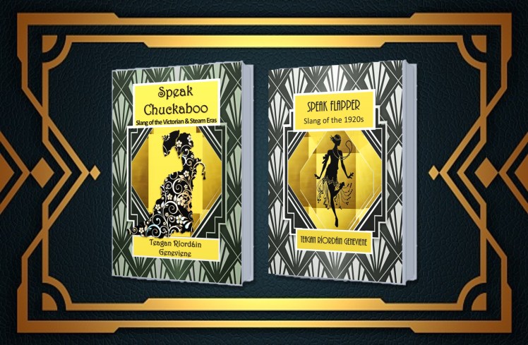
I’m showing you Speak Flapper above, for your reference, because this book is about the Roaring Twenties. It’s filled with loads of the kinds of details that authors can use to make their 1920s characters come to vivid life. Ready?
By the way — I wanted to keep it similar to Speak Flapper, but there were limits on that because of a few reasons… Maybe that isn’t all that important…
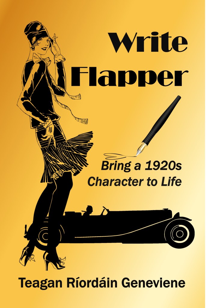
A
Black on gold, flapper and car
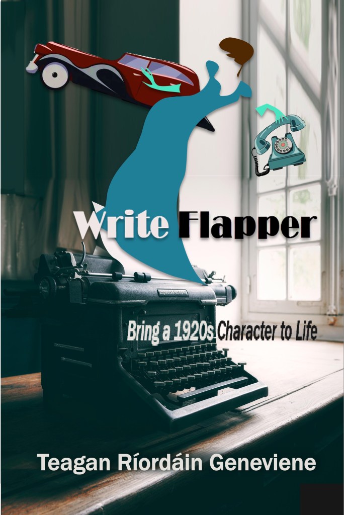
B
The least similar to the rest of my series, but maybe that’s okay…
Photo with cut-outs
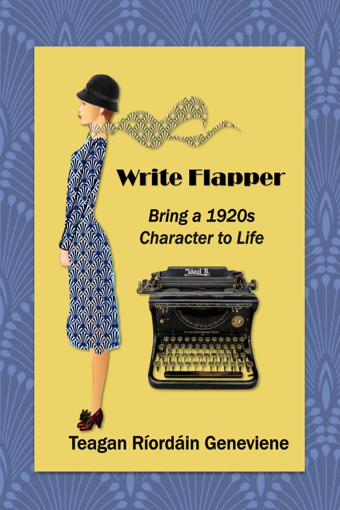
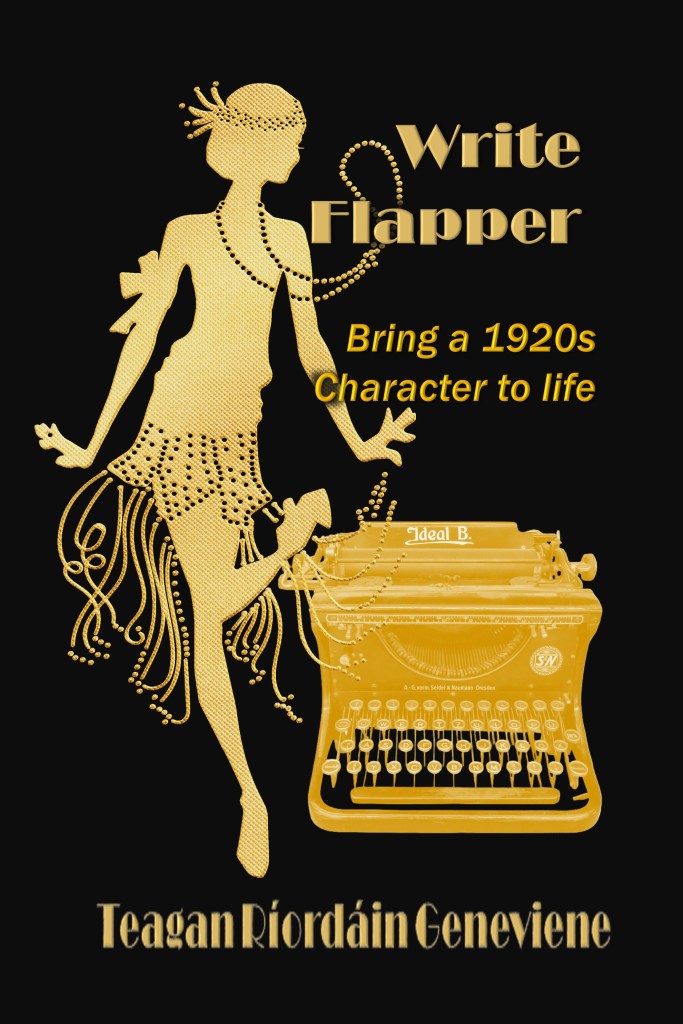
C
Cut-out flapper with typewriter and border
D
And lastly… Gold flapper dancing
Let me know which of these works best for you, keeping in mind the kind of book it is. Wishing you a splendiferous rest of the week! Hugs.
♥ ♠ ♦ ♣
Yes, here’s the obligatory shameless self-promotion…
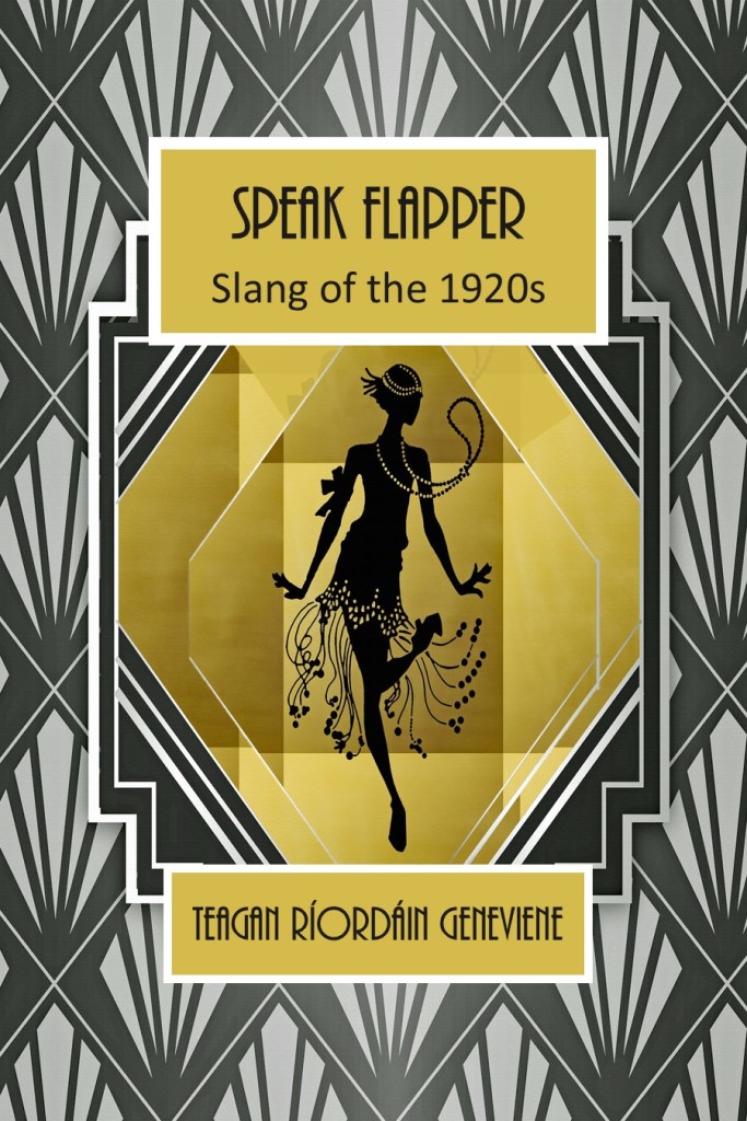
Speak Flapper: Slang of the 1920s
Universal Purchase Links
Speak Flapper
Kindle: relinks.me/B083HNK3BB
Paperback: relinks.me/1656168553
♥ ♠ ♦ ♣
This blog is entirely human-written. Furthermore, the author expressly prohibits any entity from using this publication for purposes of training AI technologies to generate text. This is a work of fiction. Characters, names, places, and incidents are either the product of the author’s imagination or are used fictitiously, and any resemblance to actual persons, living or dead, business establishments, locales, or events is entirely coincidental.
Copyright © 2026 by Teagan Ríordáin Geneviene
All rights reserved.
No part of this work may be reproduced, scanned, or distributed in any printed or electronic form without permission. Please do not participate in or encourage piracy of copyrighted materials in violation of the author’s rights.
All images are either the property of the author or provided by free sources, unless stated otherwise.

I like #4 best, but #1 and #3 are excellent as well. The only one I wasn’t as big a fan of was #2. I’m a big fan of contrasting light and dark colors, so that’s one of the reasons they appeal to me more.
LikeLiked by 1 person
It’s good to see you, Pete. Thanks for this comment. What people don’t like in a book cover is just as interesting to me as what they do like. Hugs.
LikeLiked by 1 person
it’s D for me, i like the black and gold, the kicking, lively typewriter. simple, fun, classy and sassy,
LikeLiked by 1 person
I love the way you put th, Beth. Thanks for your feedback. Hugs. 🤗
LikeLike
I prefer D the graphics and colours work better for me. A is OK but the car is too distracting. B is too “busy”, C just doesn’t work for me. Hope this helps 🤗
LikeLiked by 1 person
Yes, that’s very helpful, Brian. Thanks I really appreciate you giving feedback on each design. Hugs. 🤗
LikeLiked by 1 person
Personally, the last one appeals to me the most.
Professionally thinking.. the first one hits the mark in a quick glance.
Nice work, Teagan!
Hugs!
LikeLiked by 1 person
Two different points of view in one comment. Thanks, Resa! I appreciate you. Hugs winging back to you. 🤗
LikeLike